Editorial design: what makes magazines attractive and exciting
What leads you to buy a magazine at a news stand? This is a question companies should definitely be asking themselves if they want to make their customer or staff magazine a success. Master the art of visual journalism and you’ll be able to win over readers – and keep them.
“No advertising please”: The standard message on many people’s mailboxes has far-reaching implications for corporate marketing strategies. Your target audience is less and less apt to go for product magazines. What’s more and more likely to appeal is magazines with high-quality journalistic content and socially relevant articles on topics ranging from energy and digitalisation trends to health, housing or pensions and investments. Custom media lie somewhere between special interest and lifestyle publications. But a winning recipe isn’t just about the ingredients. You also need design specialists and creative professionals to give shape to written content and arouse the curiosity of readers.
The lure of images
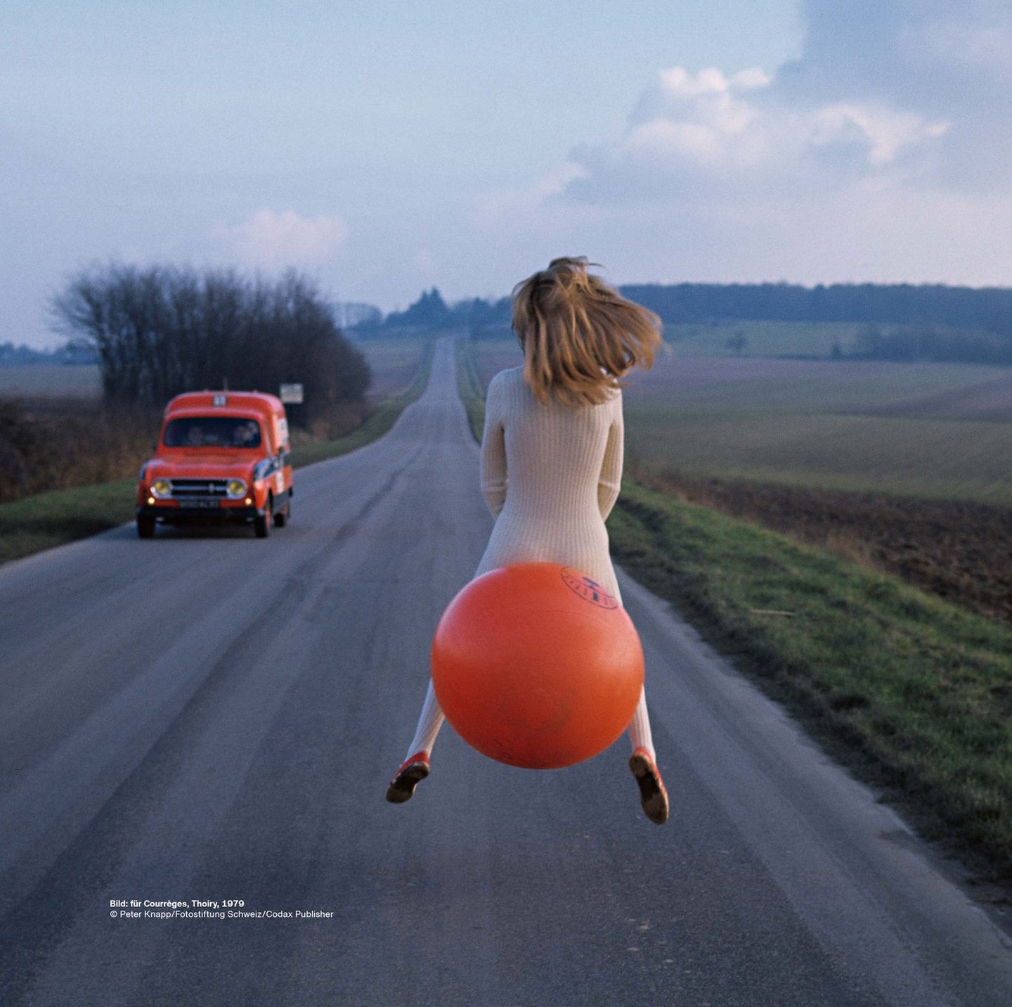
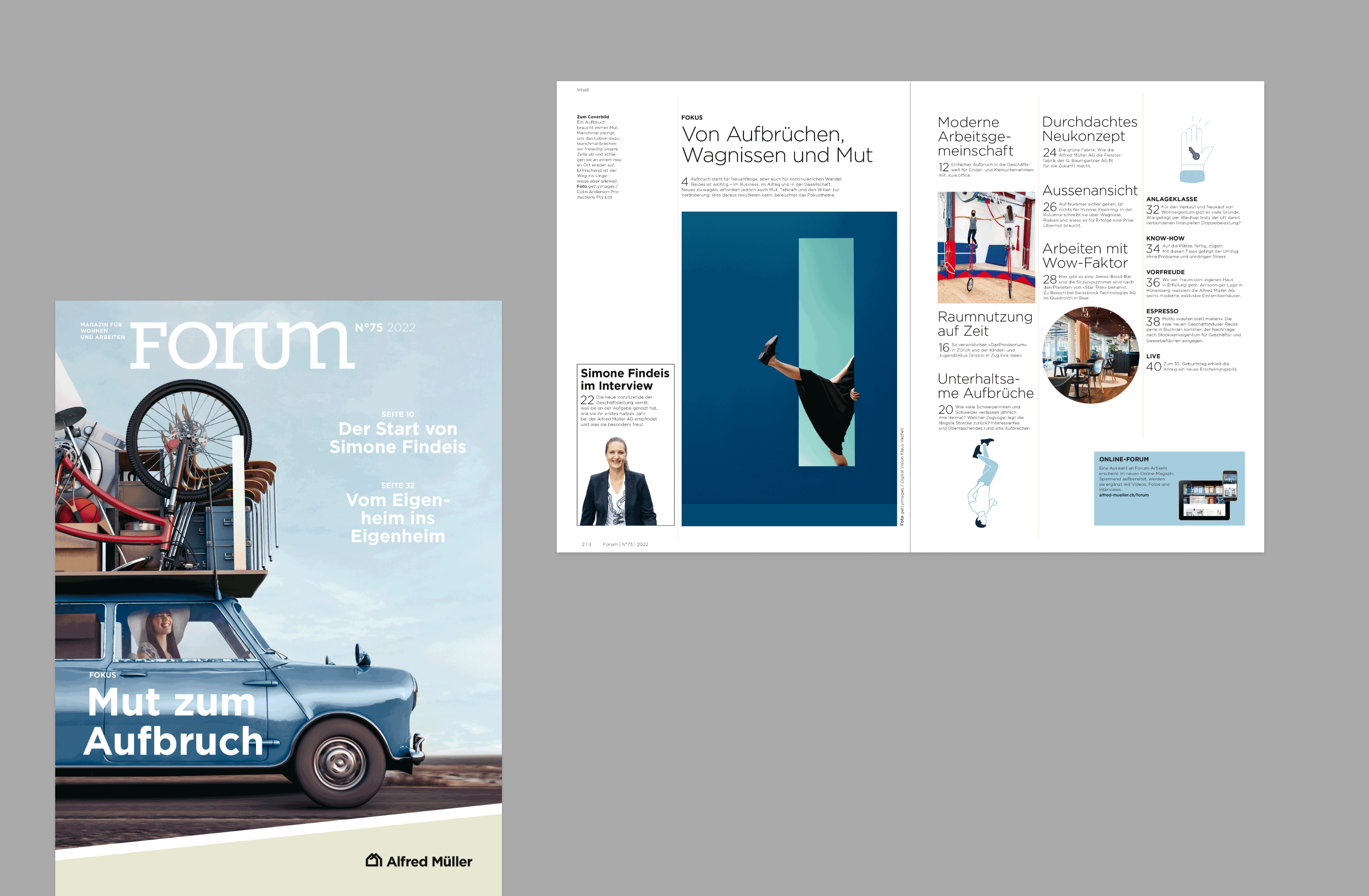
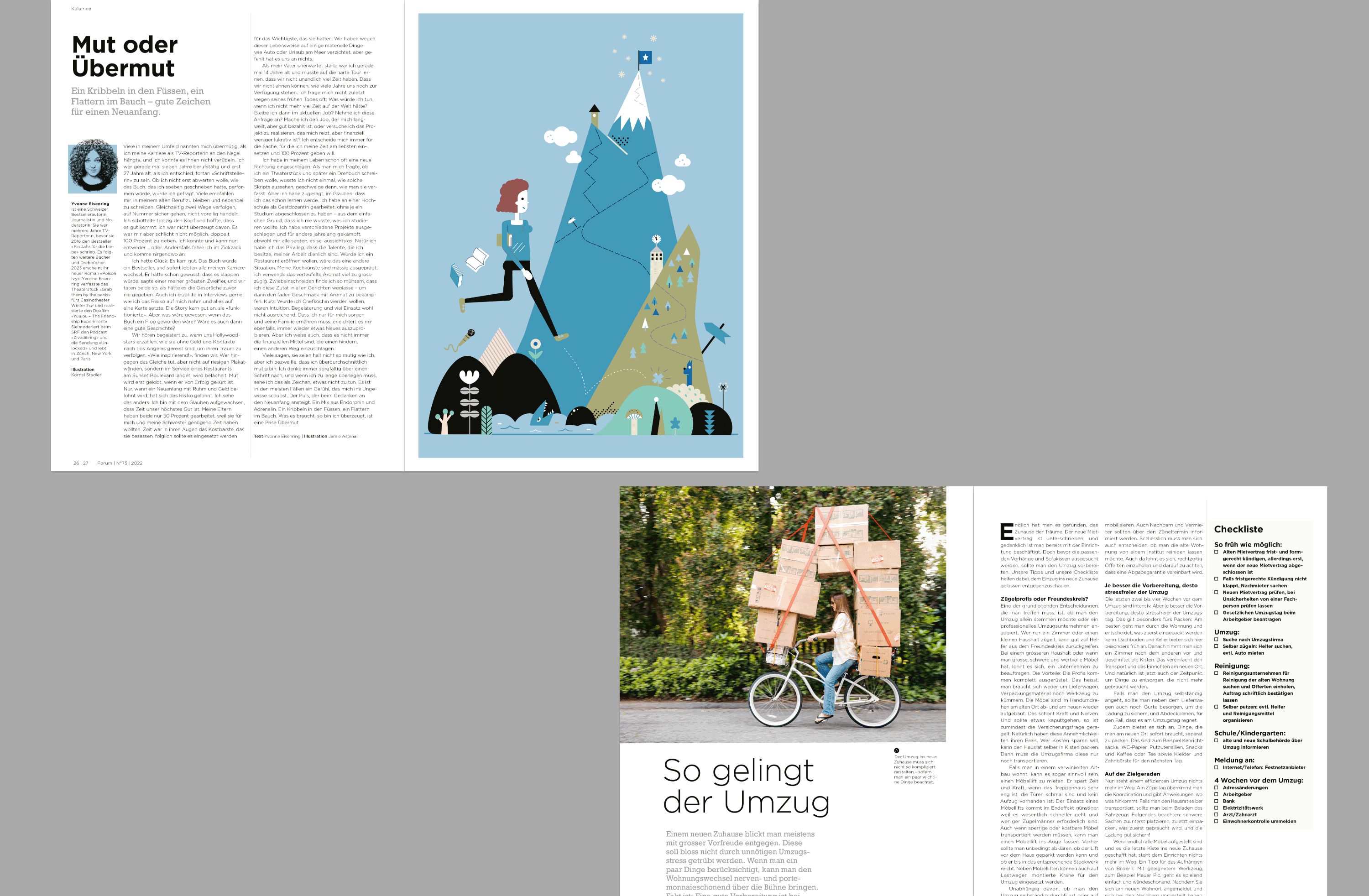
Most people will register the picture first. Whether they’re photos or illustrations, in colour or black and white, it’s images that guide our attention. The challenge for a magazine cover is to connect with readers within mere tenths of a second. First impressions count. It works, for instance, if the cover succeeds in triggering a mental cinema in the viewer’s head, perhaps because it’s original and surprising or because the combination of image and text has an emotional effect. Good designers think around corners and come up with unusual ideas that excite people.
Take me, read me!
But what does it take in terms of graphic design for readers not only to be attracted to a magazine, but to actually read it? Nicole Maack, who heads the creation and design team at Linkgroup, reveals the secret: “When you’re designing a magazine, the user experience is key.” User experience is a term taken from web development that can apply to any type of product interaction. The goal is to recognise and respond to the needs of readers.
The fact is that our reading behaviour has changed with the advent of the internet. Our attention span is getting shorter and shorter. According to a not-so-recent study by Microsoft, the attention span dropped from 12 to 8 seconds between 2000 and 2013. This is also reflected in the reading behaviour of print readers, who are getting distracted faster and faster.
What customers want
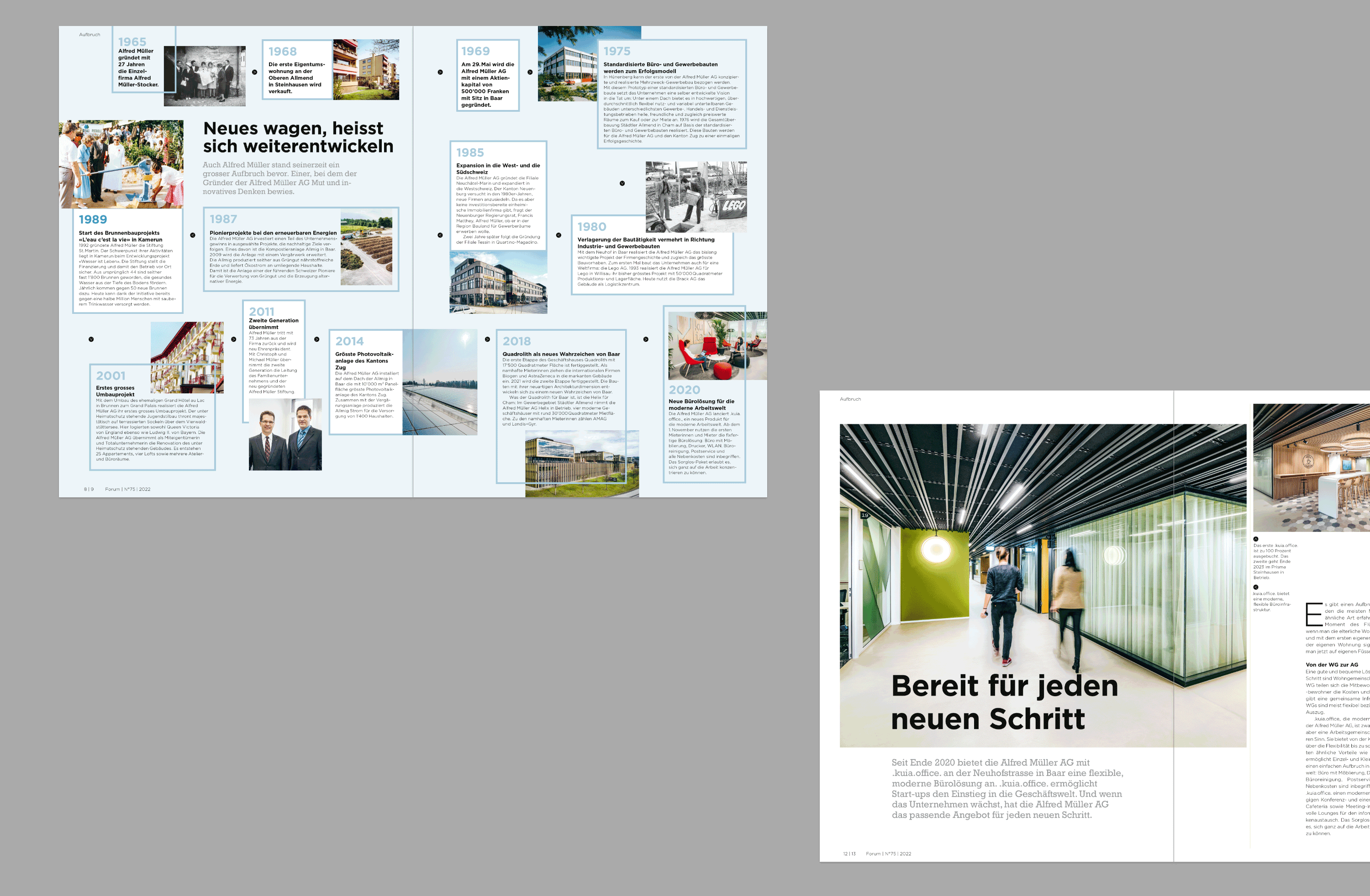
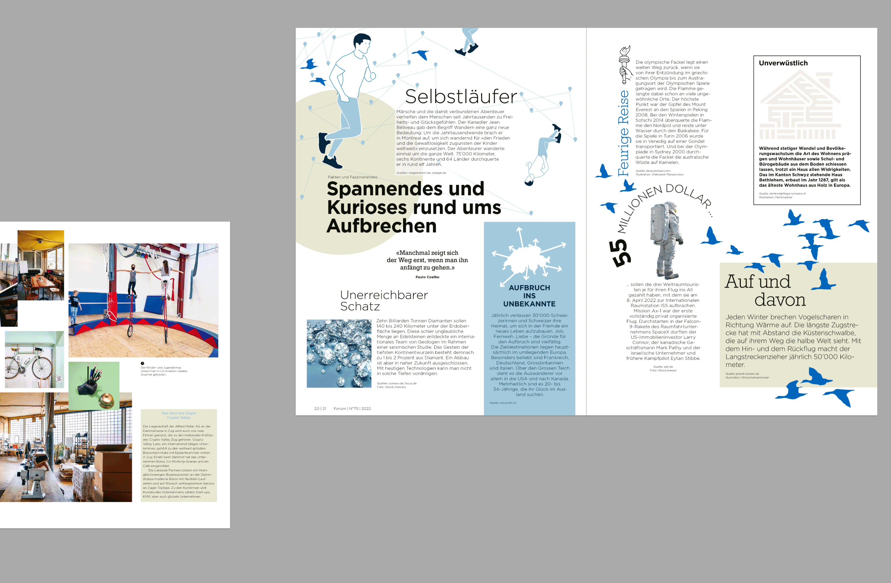
Editorial design responds to the change in reading behaviour by making content easy to digest: clearly structured and attractively arranged as design elements. The copy is enriched contextually by graphical means. “These days, the form of a magazine is like a tavolata or buffet”, explains Nicole Maack. “There are many different dishes on the table to share, and everyone can help themselves to what they fancy, in whatever order they like.”
Good editorial design:
- is surprising, touching and inspiring
- is highly memorable
- is based on a solid design concept
- skilfully plays with the possibilities
- creates a bold framework for storytelling
- uses authentic images
Dynamic and easily navigable
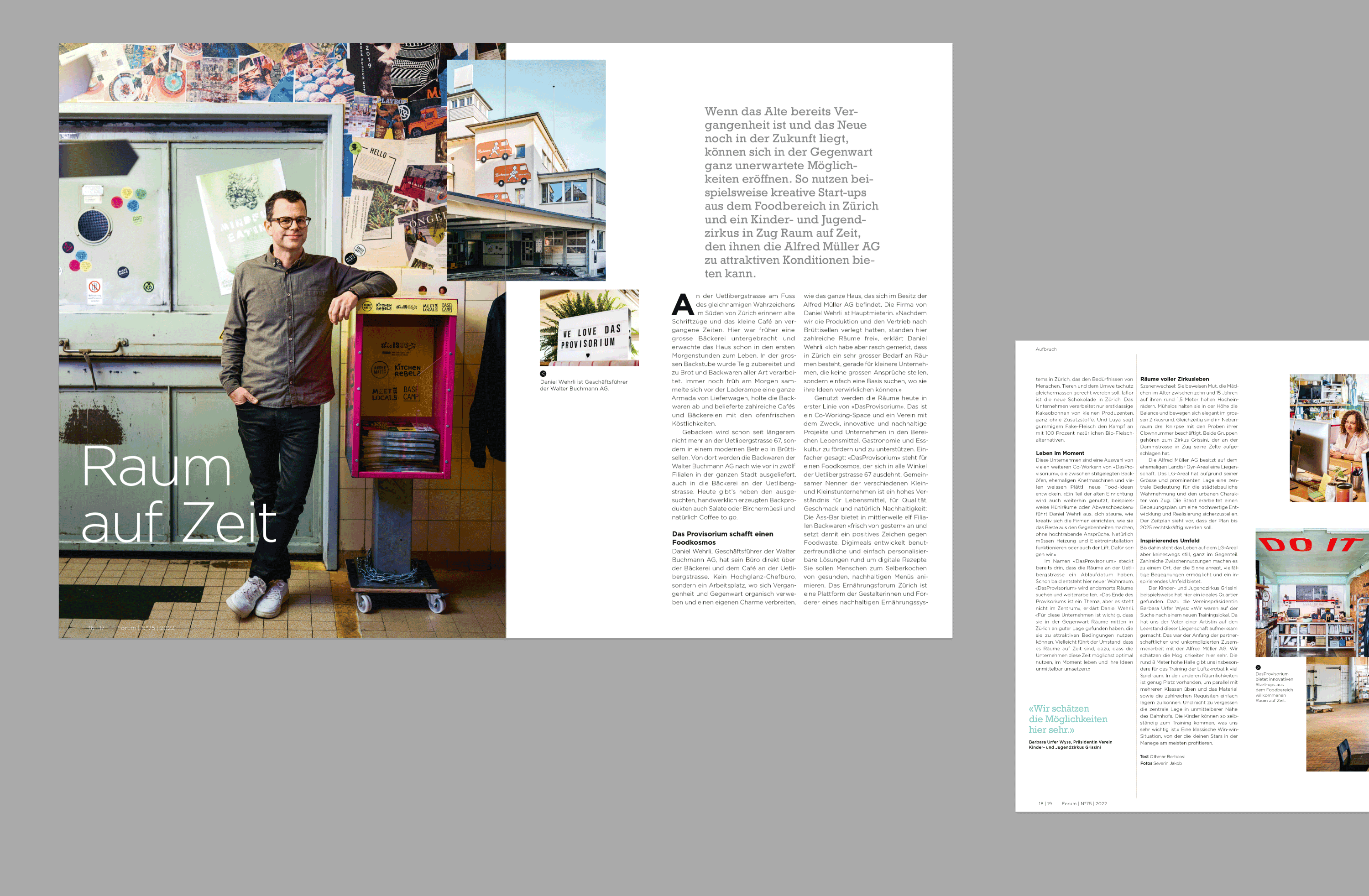
To enable readers to quickly find their way around a magazine, content is written and prepared in different containers. Each of these has its own stylistic and design characteristics, from editorial to reportage or interview to portrait. “In an interview, we start with the spoken word, which has a more dialogue-like effect if we set the text ragged. A reportage can contain typological titbits that stand out visually from the rest of the text. Our aim is to provide variety and orientation at the same time”, explains Nicole Maack.
Form and content dance the tango
“In editorial design, the content generally dictates the form”, explains Nicole Maack. “But strictly speaking, the text and the graphics pollinate each other.” When a magazine is being developed, attention is generally paid to rhythm, for example alternating longer and shorter articles. In graphical terms, attention is also paid to the ratio of text and images. The rule of thumb is fifty-fifty over the magazine as a whole. “But that doesn’t mean that every page is structured that way”, explains design expert Maack. “On the contrary, the overall weighting must be right. A picture section without text might run over four pages. On the other hand, it’s also okay to have pages of pure text. The goal of editorial design is to make sure that everything interacts dynamically.”
Quality before quantity
The goal of a customer magazine is to generate enthusiasm among as many people as possible so that customers become fans. But you have to be careful: it only works if the magazine isn’t used as a Trojan horse for the marketing department. Readers quickly recognise whether they’re looking at hidden product advertising or journalistic texts with real added value. So, it’s important for companies to have the courage to go for content – in conjunction with the creativity of editorial design.
Are your communications on track?
- Review your communications strategy: What content are your target audiences looking for, and how can you share your expertise even better with them?
- Plan to connect: What channels are your target audiences on, and how can you distribute your content as widely as possible?
- Try us out as a sparring partner: We draw on many years of expertise in publishing on all channels to analyse your existing communications and show you opportunities to reach your target audiences directly without detours.
We guide you from analysis to strategy, identifying topics and editorial support all the way to preparing copy.
