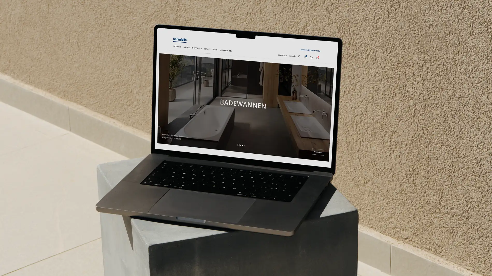
How can a large product range be made intuitively accessible to different target groups? That was one of the central questions in the redesign of the Wilhelm Schmidlin AG website. An iterative design process – from user flows through prototypes to testing – laid the foundation for a fresh, modern and clear user experience. Linkgroup, as a one-stop shop, was responsible for the entire implementation of the project.
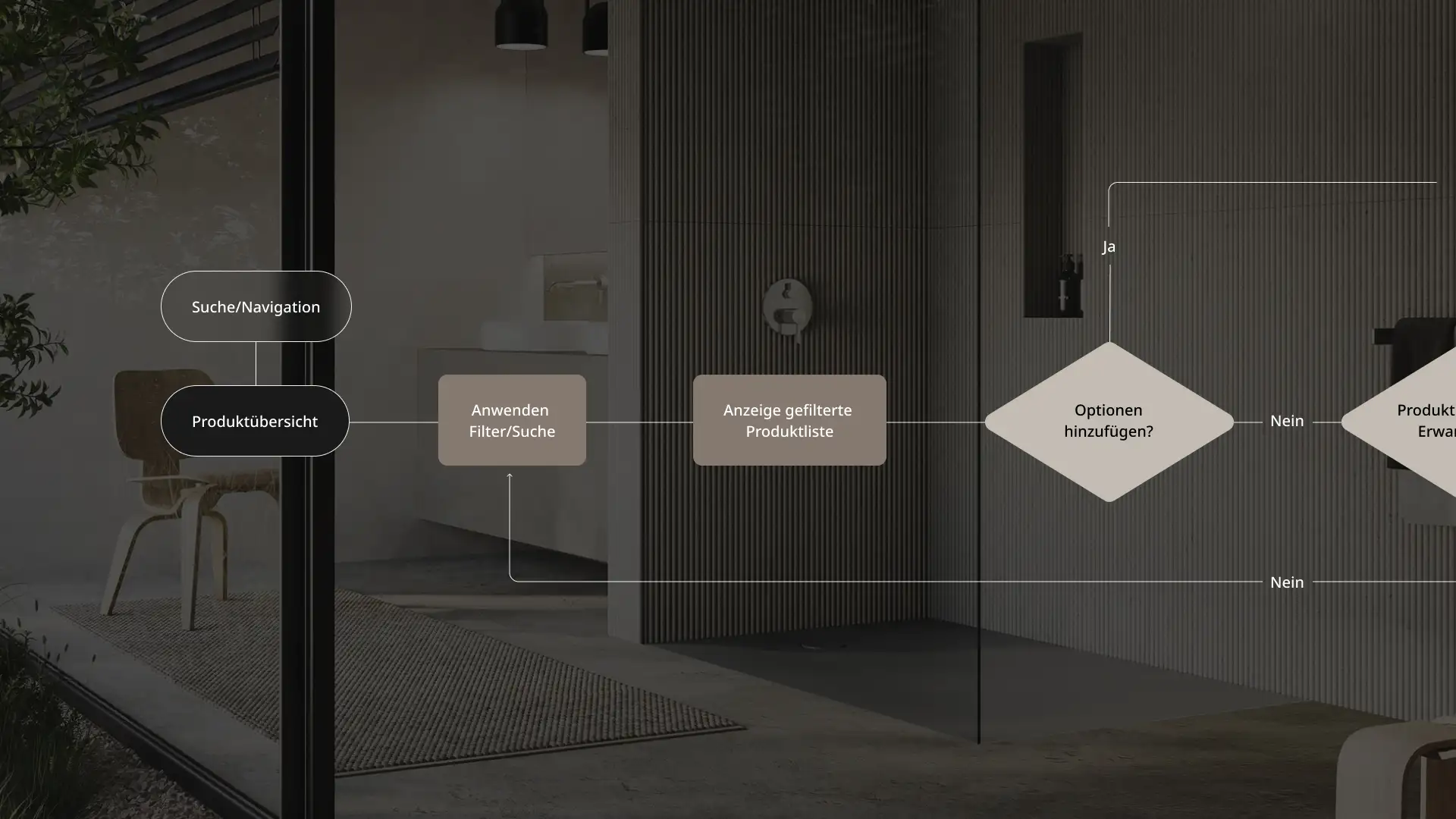
User flows make goals visible
The starting point was a website that was no longer up to date and no longer reflected the brand experience offered by this provider of high-quality bathroom products. How can architects, plumbing professionals and private homeowners be guided to the right product in the best possible way and supported in their needs? To answer this question, a user flow was developed, which laid the foundation for information architecture, navigation and prototype.
Complex range, clear orientation
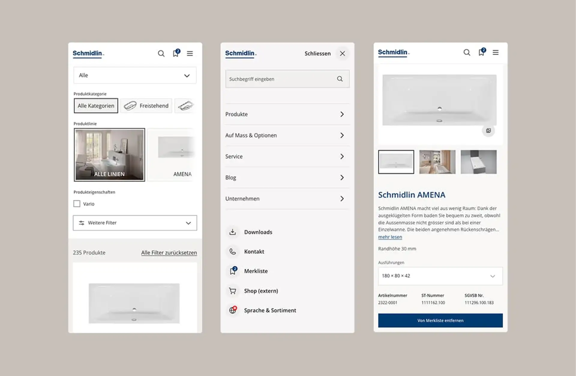
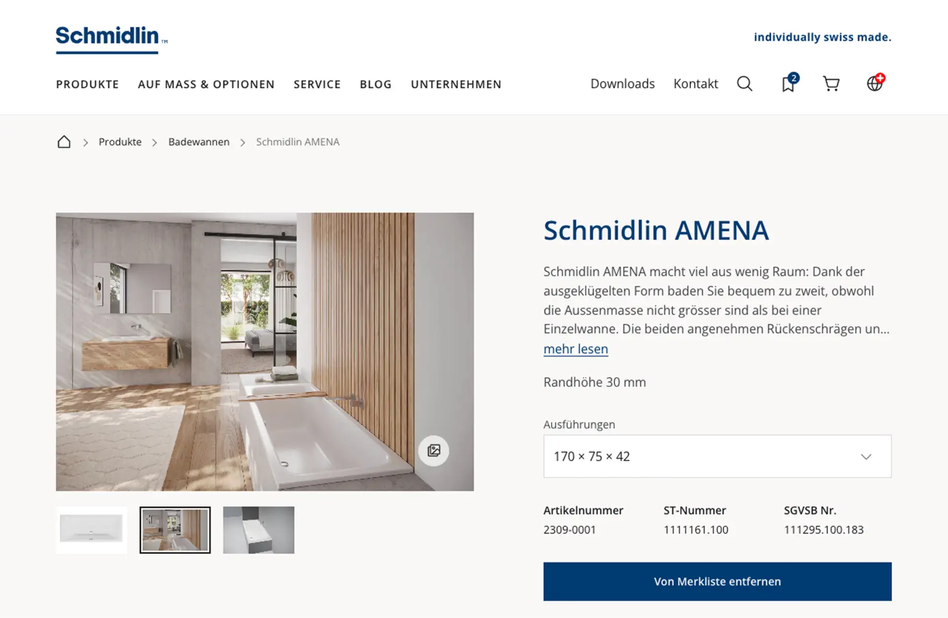
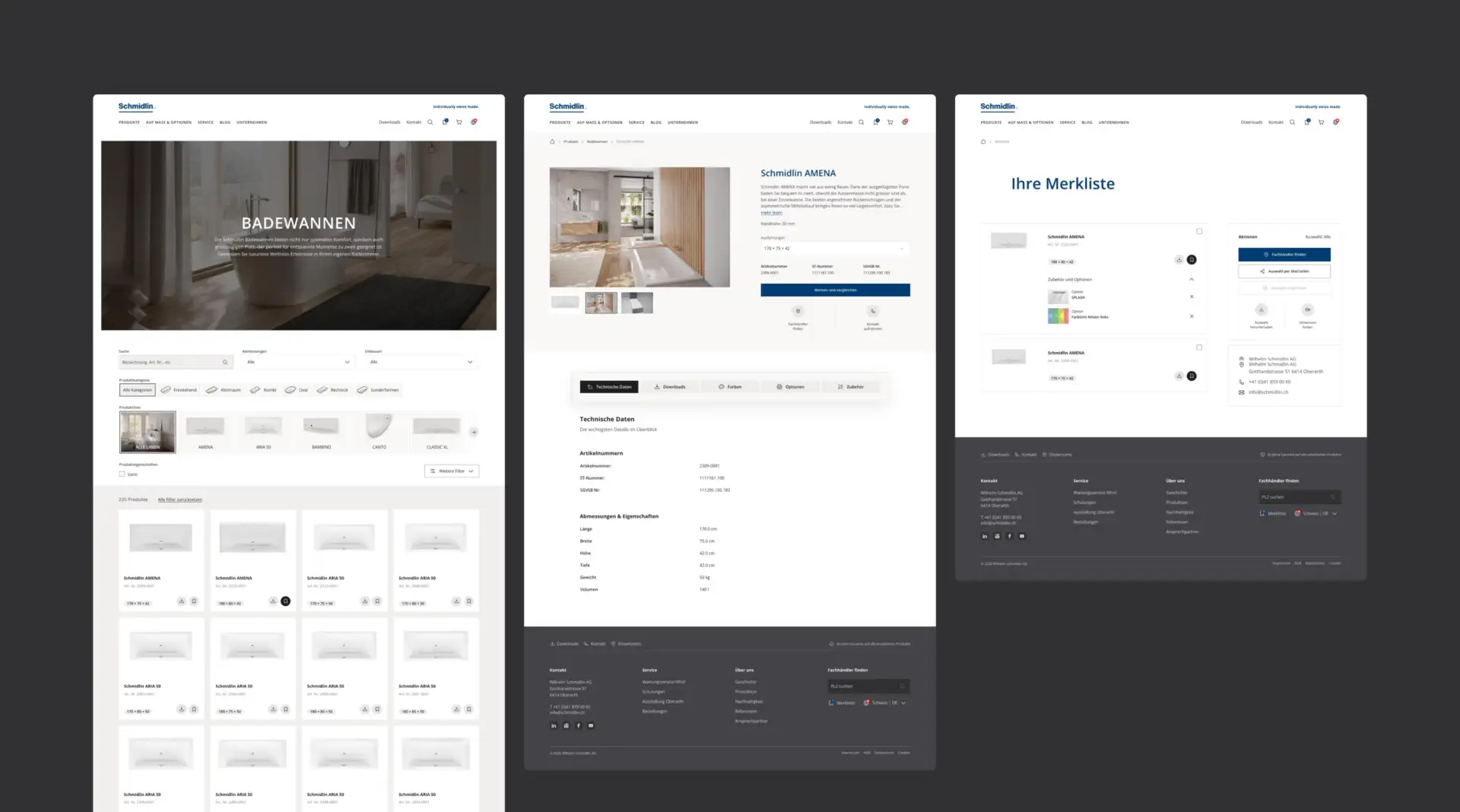
The large product portfolio, connected via a product information management (PIM) system, places high demands on structure and filters. A new, interactive and intuitive filter system with product images and category illustrations simplifies orientation. Product pages put the decisive information in focus: generous product images and galleries, technical data, and downloads and fact sheets. This way, users find all the information in one place.
From the wishlist to the specialist retailer
As products cannot be bought directly through the website, the path after the selection must be clear. The wishlist brings products together with their options and groups them clearly. Users can compare products, forward their selection by email and find suitable specialist retailers. In this way, the SEO-optimised website supports the next step in the customer journey.
Test, refine, simplify
The user flows were turned into clickable prototypes in Figma and tested with Schmidlin’s customers. The focus was on navigation, terminology and simple, intuitive operation. Feedback was incorporated iteratively into the UX/UI design. In this way, user guidance was reviewed and refined against concrete usage scenarios.
A fresh look with a clear visual language
The new design combines functional user guidance with a modern visual appearance. A refined colour concept, more generous spacing and a larger visual world give the products room. Galleries show details, and technical data and downloads are clearly arranged. Subtle micro-animations bring movement to the experience without distracting from the content. The brand world is also brought to life: the career page features a video slider with short statements, and a history slider presents the company’s history in an attractive way.
“We have looked at the website consistently from the perspective of our different target groups. It was particularly valuable that we could test user flows and prototypes with customers. This allowed us to sharpen navigation and the product overview in a targeted way. The new website positions our brand ideally, gives our large range a clear structure and makes it easier to find the right product and the specialist retailer.”
Christel Zimmermann
Deputy Head of Marketing Communications, Wilhelm Schmidlin AG
Website
Project team
Schmidlin: Christel Zimmermann (Deputy Head of Marketing Communications)
Linkgroup: Othmar Krienbühl (Partner), Iris Kramer (Project Management), Franco Troxler (Concept, UX/UI Design)
Your contact
Othmar Krienbühl
Partner
T +41 44 268 12 62
M +41 79 430 11 91
othmar.krienbuehl@linkgroup.ch